
Subtotal $0.00
In the world of web development, creating responsive and visually appealing websites is crucial to providing an excellent user experience. But making these designs from scratch can be time-consuming, especially when considering different screen sizes and devices. That’s where Bootstrap comes in. If you’re wondering what is Bootstrap in web development, you’re in the right place. This blog post will provide a comprehensive guide on Bootstrap, its key features, and how it is used in web development.
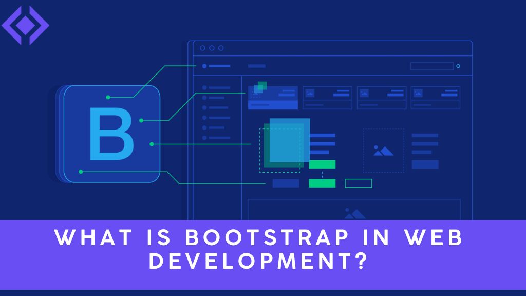
Introduction: Understanding Bootstrap and Its Importance
Bootstrap is a popular front-end framework that helps developers create responsive, mobile-first websites quickly. Originally developed by Twitter, Bootstrap has grown into one of the most widely used web development frameworks, thanks to its easy-to-use components, consistency, and scalability.
Whether you’re a beginner or an experienced developer, Bootstrap can save you time and effort in building complex layouts. It provides pre-designed templates and components, like buttons, navigation bars, and grids, that you can easily implement into your web projects. It takes away much of the repetitive work involved in creating a responsive and user-friendly interface.
Key Benefits of Using Bootstrap in Web Development
Before we dive into the specifics of how Bootstrap works, let’s take a look at some of the key benefits that make it such a popular choice for web developers:
1. Responsive Design
One of the main advantages of using Bootstrap is that it makes building responsive websites easier. A responsive website automatically adjusts its layout depending on the device’s screen size, ensuring an optimal viewing experience for users. With Bootstrap’s grid system, you can create flexible layouts that work seamlessly on desktops, tablets, and mobile devices. This is especially important in today’s world, where more users browse websites on their smartphones.
2. Pre-built Components
Bootstrap offers a collection of pre-designed, reusable components such as buttons, forms, modals, alerts, navbars, and much more. These components are easy to integrate into your project, saving you the time and effort needed to design them from scratch. All you have to do is customize them to fit your website’s style and branding.
3. Customizable and Extensible
Bootstrap is highly customizable. You can modify its default styles to align with your brand by adjusting its built-in themes or creating a completely new one. You can even add custom CSS if needed. Additionally, Bootstrap’s Sass variables allow you to modify the framework’s styles globally.
4. Cross-browser Compatibility
Bootstrap ensures that your website looks great on all major browsers (Chrome, Firefox, Safari, Edge, etc.). It comes with built-in styles and fixes to deal with inconsistencies across browsers, so you don’t have to worry about testing your design on multiple platforms.
5. Open-Source and Free
Bootstrap is open-source, meaning it is free to use for any personal or commercial project. As a result, it has a large community that regularly contributes to the framework’s growth. Being open-source also means that you can access its full codebase, which is well-documented and maintained.
How Bootstrap Works: A Step-by-Step Guide
1. The Bootstrap Grid System
Bootstrap’s grid system is based on a 12-column layout, which allows you to divide the page into various sections with different widths. By using classes like col-md-6 or col-lg-3, you can control the number of columns your content spans. The grid system automatically adjusts itself based on the screen size, ensuring a responsive design without additional code.
Example of a Bootstrap Grid:
<div class="row">
  <div class="col-md-6">
    <p>Column 1</p>
  </div>
  <div class="col-md-6">
    <p>Column 2</p>
  </div>
</div>
In this example, the page will have two columns that each take up 50% of the available width on medium-sized devices. On smaller devices, they will stack vertically.
2. Using Bootstrap Components
Bootstrap provides a variety of UI components that you can add to your website. These components include:
- Buttons: Easily styled and can trigger actions or navigate to other pages.
- Forms: Ready-to-use form controls, such as text fields, radio buttons, and checkboxes.
- Modals: Interactive pop-up windows for displaying messages or additional content.
- Navigation Bars: Pre-styled menus for website navigation.
Example of a Bootstrap button:
<button type="button" class="btn btn-primary">Click Me</button>
This simple button is automatically styled with Bootstrap’s primary color and padding, but you can further customize it to suit your design needs.
3. Using JavaScript Plugins
Bootstrap includes several built-in JavaScript plugins for enhanced functionality. These plugins are easy to integrate with your project and don’t require external libraries. Some of the most commonly used plugins include:
- Carousel: For creating image sliders or carousels.
- Tooltip: For adding tooltips to elements on hover.
- Collapse: For creating collapsible sections or accordions.
Example of a Bootstrap carousel:
<div id="carouselExample" class="carousel slide" data-bs-ride="carousel">
  <div class="carousel-inner">
    <div class="carousel-item active">
      <img src="image1.jpg" class="d-block w-100" alt="...">
    </div>
    <div class="carousel-item">
      <img src="image2.jpg" class="d-block w-100" alt="...">
    </div>
  </div>
</div>
4. Customization with Bootstrap Themes
Although Bootstrap comes with a default design, it’s easy to create a customized theme to match your brand. You can adjust the colors, fonts, spacing, and more by modifying the Bootstrap theme or by using the Bootstrap Customize tool. This allows you to tailor the framework to your specific design requirements.
5. Integrating Bootstrap with Other Technologies
Bootstrap can be easily combined with other front-end technologies such as HTML5, CSS3, and JavaScript. It can also be used with back-end technologies such as PHP, Python (Flask/Django), and Node.js to create dynamic, database-driven websites.
Practical Applications of Bootstrap in Web Development
Bootstrap is used in various real-world web projects because it allows for rapid development and consistency across websites. Here are some common use cases for Bootstrap:
- Personal Websites and Portfolios: Developers use Bootstrap to quickly design responsive portfolios to showcase their work.
- Business Websites: Bootstrap is perfect for building professional business websites that need to look good on all devices.
- E-commerce Websites: Many e-commerce platforms use Bootstrap to create user-friendly and responsive online stores.
- Blogs: Bootstrap can be used to build visually appealing blogs with responsive layouts.
Conclusion: Why Bootstrap is a Game-Changer in Web Development
In conclusion, Bootstrap is an essential tool for modern web development. Its responsive grid system, pre-built components, and easy customization options make it a go-to framework for developers looking to create clean, functional, and mobile-friendly websites. Whether you’re a beginner or an experienced web developer, Bootstrap can help you save time, streamline your workflow, and create stunning websites that work across all devices.
Actionable Tips for Getting Started with Bootstrap:
- Start with the Documentation: Familiarize yourself with the official Bootstrap documentation to understand its core features.
- Experiment with Components: Begin by integrating basic Bootstrap components into a small project.
- Practice Responsiveness: Use the grid system to practice building layouts that work on different screen sizes.
Bootstrap is here to stay, and by leveraging its power, you can build responsive websites faster and more efficiently than ever before. So, dive in and start creating!